Imagining a “North Star” vision
A team-based effort to build a multi-layered prototype that visualizes executive strategy as they envisioned users navigating through a student to professional lifecycle.
Illustrations by one of our team’s visual designers
Overview
A 4-month vision setting initiative in which brought together a representative group of designers from across Autodesk organizations to tell the story of Dieter, a customer persona starting their Autodesk journey as a student and relies on us as they grow within their professional career.
Problem
How can we craft a cohesive and personalized experience for a user when they start their journey with Autodesk products as a student and then follow them through their professional career advances?
Goal
Work with a team of designers and stakeholders across organizations to jointly develop a conceptual “north star” vision of experiences that could illustrate a user’s journey by subscribing to Autodesk products.
Role
I was one of the UX designers, in a team of 3. I was responsible in crafting experiences that focused on how users access and manage Autodesk subscriptions. My other team members focused on two other subject areas, which were purchasing Autodesk subscriptions and getting help or learning content for purchased software. We were collectively briefed each sprint and worked with business owners, product management, content designers, and visual designers to build a conceptual experience as a deliverable.
Scenario overview designed by one of the team’s visual designers.
Process
This vision project had a total of 10 scenarios, each highlighting an overarching “big idea” defined by executive leadership. In order to complete this project, the working team adopted an agile methodology, using a 2-week sprint structure. At the start of each working sprint, business owners and UX research briefed us on the design scenario/problem that needed to be solved. Our working team would hear from recorded customer interviews their pain points, find common themes, and notate key experiences to focus on. Once briefed, our team of 3 working UX designers would start our sprint process.
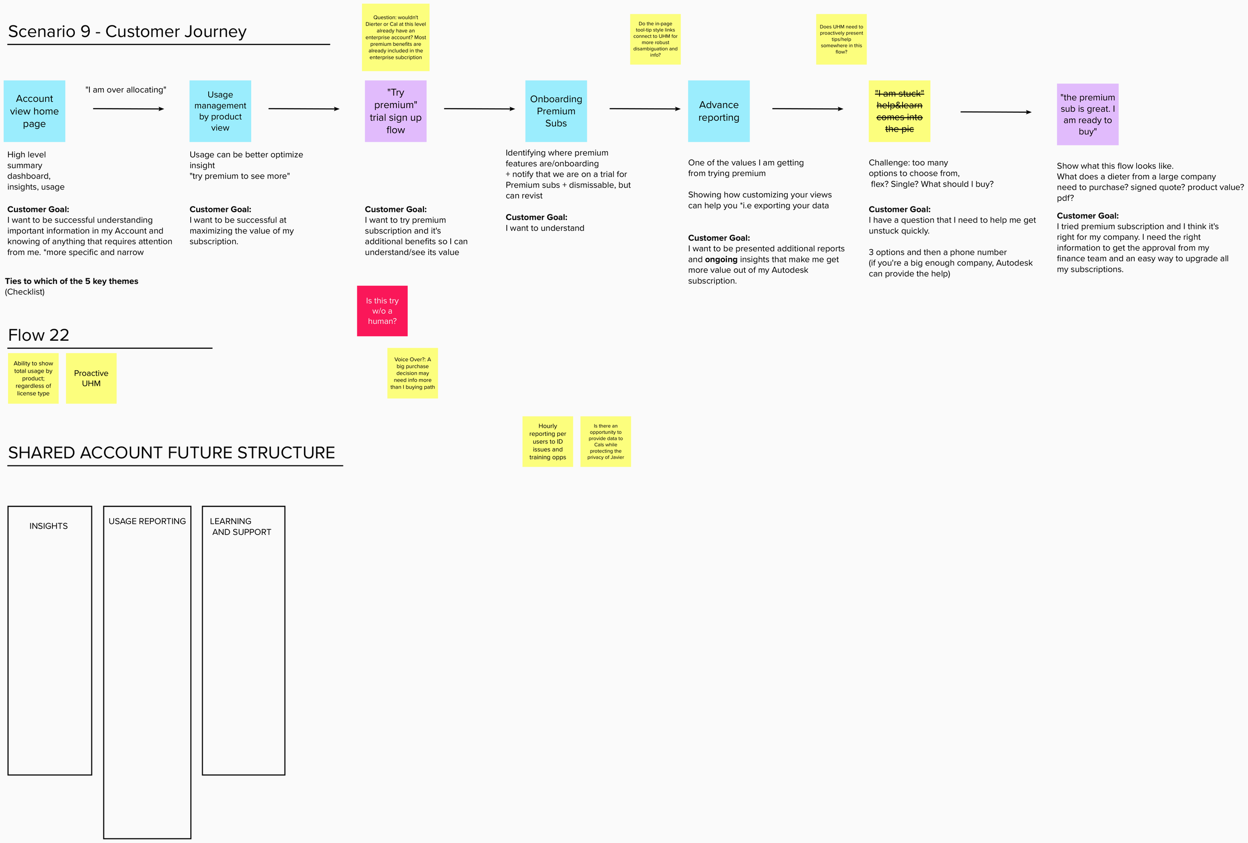
First, we would conduct a brainstorming session to synthesize the customer needs and whiteboard a user flow. This was either often done in person or via Mural (online white boarding tool), mapping out what experiences we wanted to craft and meet customer expectations. This was our opportunity to bring our unique perspectives and expertise in each of our domains to the table and connect a cohesive narrative.
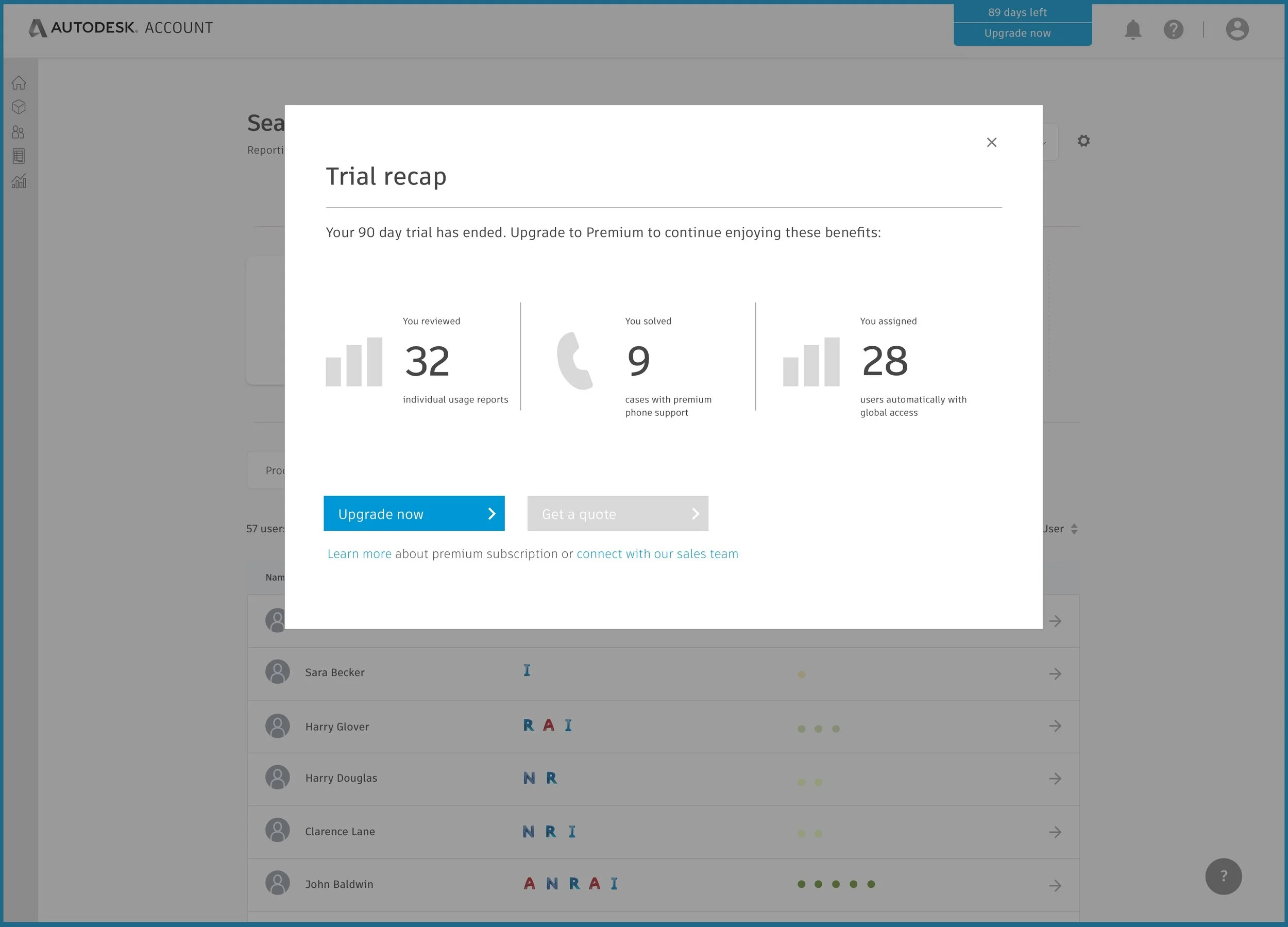
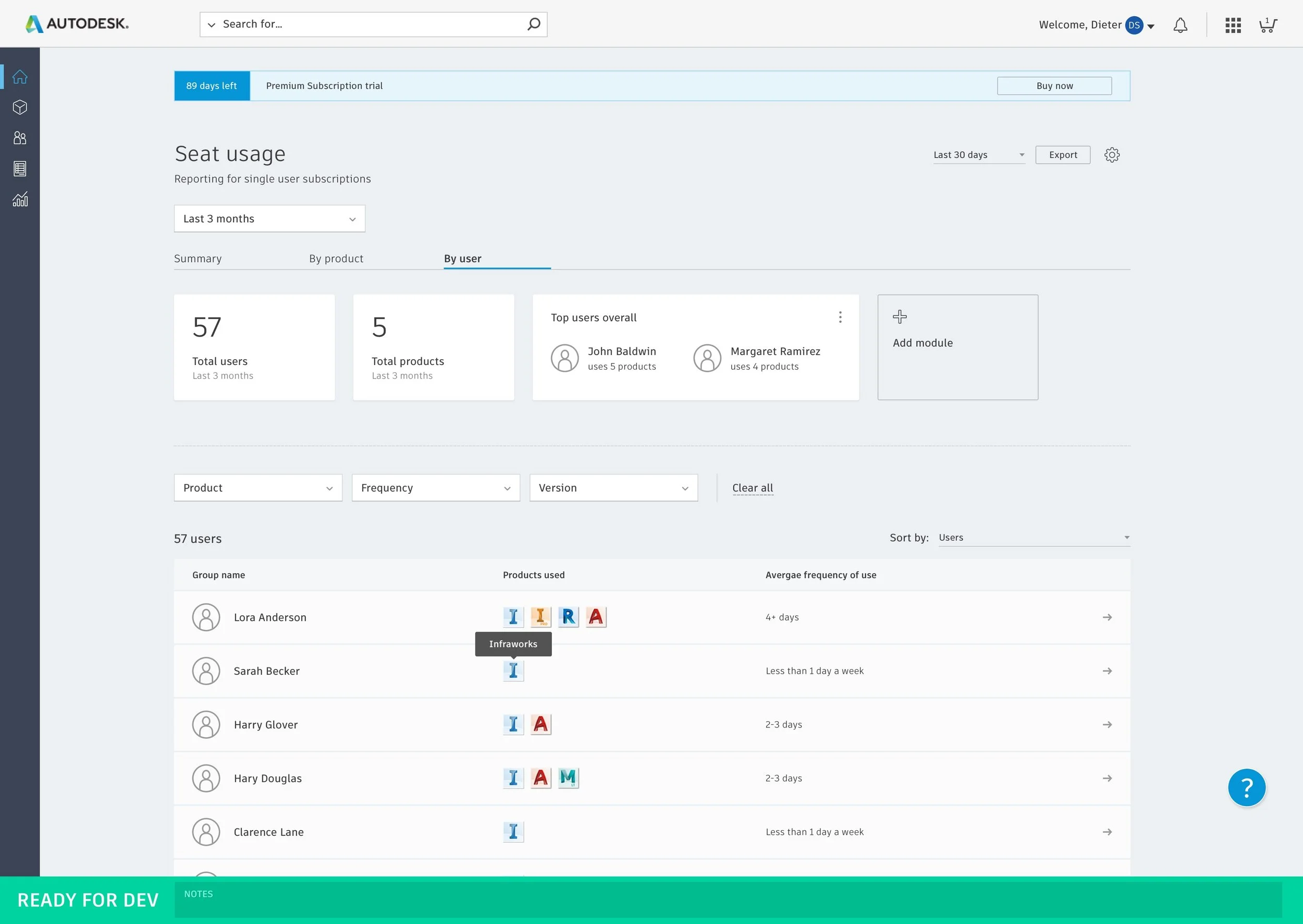
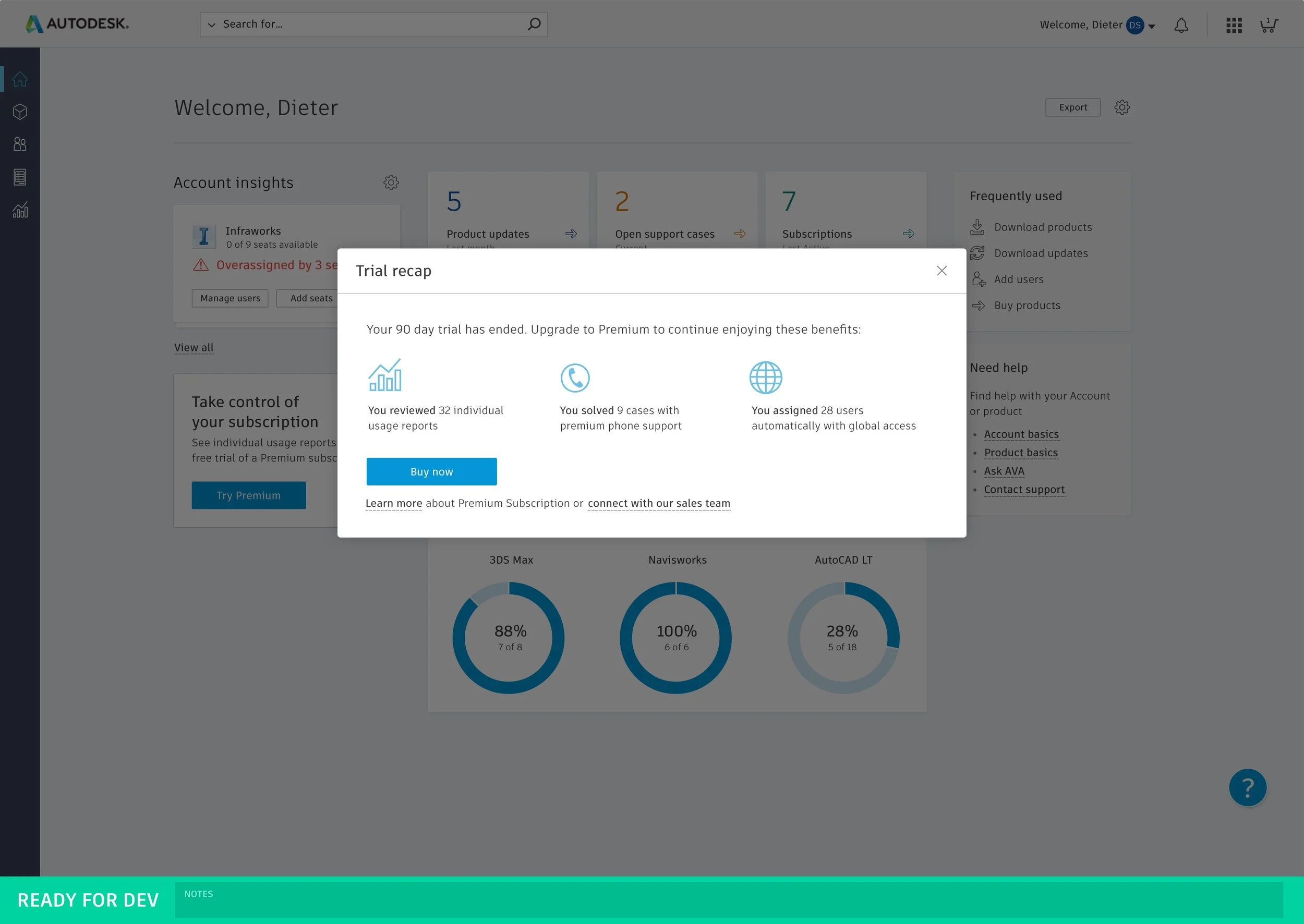
Once we aligned on the narrative flow, each designer would split apart the user flow and design wireframes based on our map. I was responsible for experiences focused on users that had to access and manage their purchased Autodesk subscriptions, meaning that if users had to download or conduct management tasks of their purchased subscriptions, I would design that as I was a designer on Autodesk Account (web portal for purchasers of Autodesk software to manage their subscriptions). Other members of our team focused on the purchasing experience and learning/help experiences.
After a week, the larger working group would come together in a mid sprint demo to show in progress work to business owners and stakeholders. They would provide feedback to UX and ensure the intended concept matched the big idea brief and higher-level strategic intent. Our working UX team would iterate and fine tune designs with the feedback we received.
At the end of the sprint, our team along with ~ 15 stakeholders, a broader business audience, and high level executives would come together to see our concept in the form of an InVision prototype. We would demo our user flow, how we arrived to our solution rooted in customer research, and detailed walkthrough of the experience.
Outcome
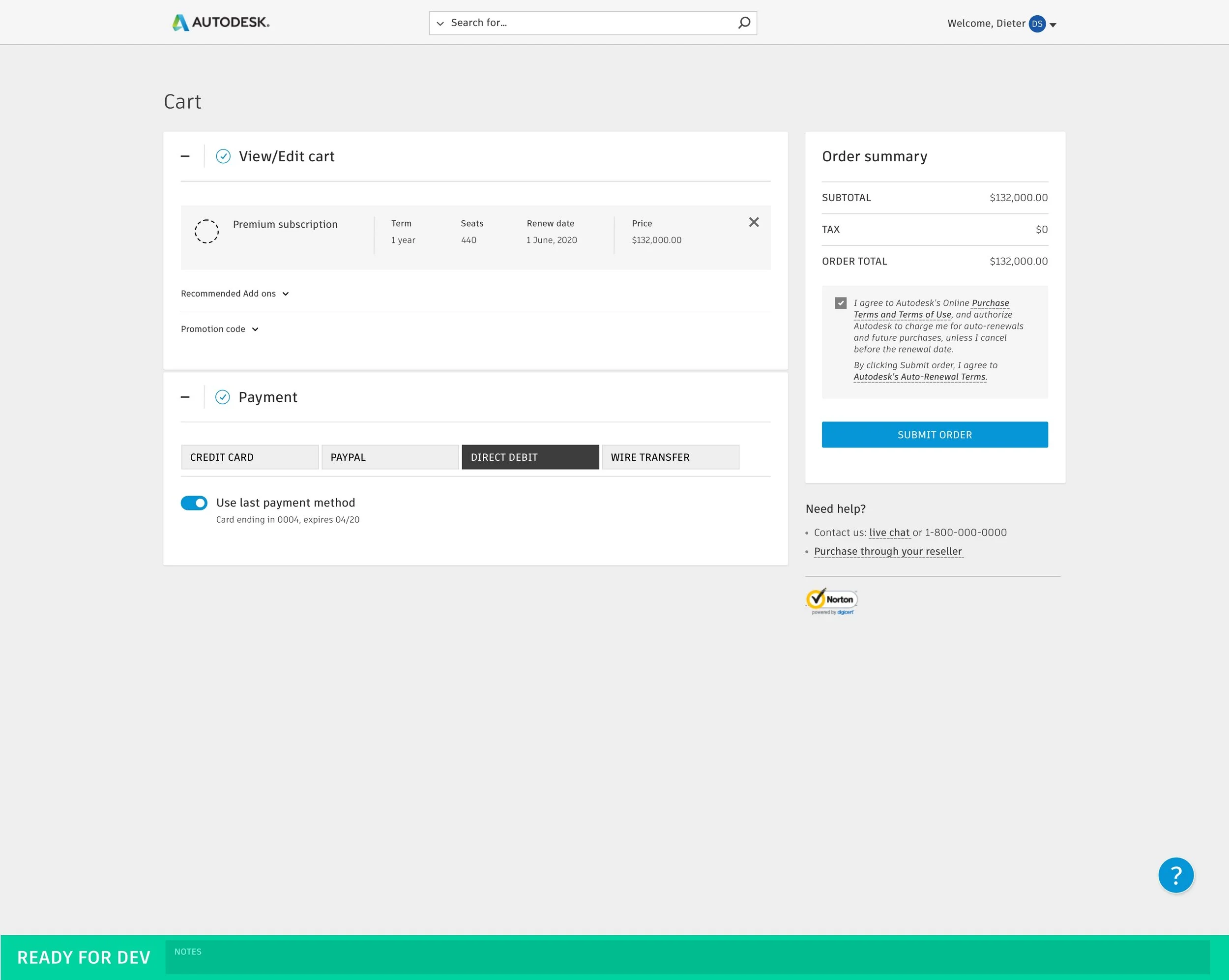
Our team delivered 5 multi-layered user flows that accounted for half of the project’s big idea experiences. Each UX wireframe flow was then handed off to visual designers and front end developers to refine and create a clickable prototype that can be completely interactive when demoing to stakeholders. The prototype was completed on time within the time frame of 4 months.
It was highly received by internal stakeholders and provided visuals for strategic thought among higher level executives. The project’s agile process and sprint methodology was something new in our design organization, and was piloted on this initiative. The process and working structure was also well-received to bring a 4-month initiative to a successful close.


